The Earth Project, by developer Cameron Beccario, has arised in 2014 as one of the most popular global weather forecast viewers, due to its innovative design and visualization features. It displays air and ocean information in a friendly designed interface powered by d3js javascript library. It is a great example of how to make weather data look awesome! On this post we want to talk not only about the interface but also about the technology and data sources behind this great tool.
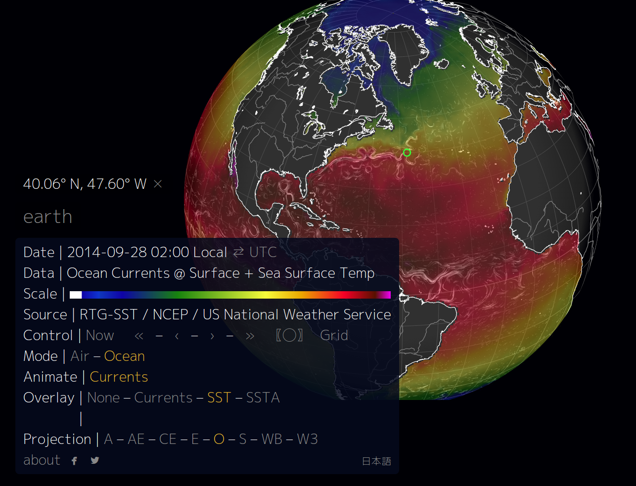
The image below is an example of how the Earth Project represents ocean currents (white lines) and a color map representing the sea surface temperature. You can see the correlation between these two parameters. Strongest currents appear where the difference of temperature is higher. For advanced readers: If you use JPL images for SST instead of non-realtime data this relationship is even stronger.
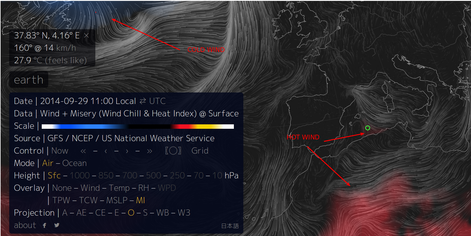
A really exciting feature of the interface is that you can access a specific view using the URL. Direct link to a particular visualization. The following image displays wind as lines and the wind chill heat index as a colomarp. The image shows cold winds from north america and hot wind from the north of africa going to south europe.
The listed variables are:
Atmospheric pressure corresponds roughly to altitude several pressure layers are meteorologically interesting they show data assuming the earth is completely smooth
note: 1 hectopascal (hPa) ≡ 1 millibar (mb)1000 hPa | ~100 m, near sea level conditions
850 hPa | ~1,500 m, planetary boundary, low
700 hPa | ~3,500 m, planetary boundary, high
500 hPa | ~5,000 m, vorticity
250 hPa | ~10,500 m, jet stream
70 hPa | ~17,500 m, stratosphere
10 hPa | ~26,500 m, even more stratosphere
The “Surface” layer represents conditions at ground or water level this layer follows the contours of mountains, valleys, etc. overlays show another dimension of data using color some overlays are valid at a specific heightwhile others are valid for the entire thickness of the atmosphere
Wind | wind speed at specified height
Temp | temperature at specified height
TPW (Total Precipitable Water) | total amount of water in a column of air stretching from ground to space
TCW (Total Cloud Water) | total amount of water in clouds in a column of air from ground to space
MSLP (Mean Sea Level Pressure) | air pressure reduced to sea level
MI (Misery Index) | perceived air temperature combined heat index and wind chill
Data Sources
This is a great interface to display data, which not only needs to be pretty but also useful and accurate. Below, a list of the data used for this project.
Meteorological data:
Weather data is produced by the Global Forecast System (GFS), operated by the US National Weather Service. Forecasts are produced four times daily and made available for download from NOMADS. The files are in GRIB2. The Global Forecast System (GFS) is a weather forecast model produced by the National Centers for Environmental Prediction (NCEP). Dozens of atmospheric and land-soil variables are available through this dataset, from temperatures, winds, and precipitation to soil moisture and atmospheric ozone concentration. The entire globe is covered by the GFS at a base horizontal resolution of 18 miles (28 kilometers) between grid points, which is used by the operational forecasters who predict weather out to 16 days in the future. Horizontal resolution drops to 44 miles (70 kilometers) between grid point for forecasts between one week and two weeks. The GFS model is a coupled model, composed of four separate models (an atmosphere model, an ocean model, a land/soil model, and a sea ice model), which work together to provide an accurate picture of weather conditions. Changes are regularly made to the GFS model to improve its performance and forecast accuracy. It is a constantly evolving and improving weather model. Gridded data are available for download through NOMADS. Forecast products and more information on GFS are available at the GFS homepage.
Ocean data:
Here you can see another example of how ocean data is more complicated to use than meteorological data. They use different data sources and different formats to get information from the ocean.
Ocean Currents
To display Ocean currents they use Ocean Surface Current Analyses Real-time (OSCAR); which is a project to calculate ocean surface velocities from satellite fields. Surface currents are provided on global grid every ~5 days, dating from 1992 to present day, with daily updates and near-real-time availability. The data is freely available through two data centers operated by NOAA and NASA. The NASA PO.DAAC site (https://podaac.jpl.nasa.gov) serves OSCAR currents on both 1 degree and 1/3 degree grid spacing in netcdf format only. This is the more reliable data source. The NOAA site (www.oscar.noaa.gov) provides data in both downloadable images and netcdf format. Validation statistics are also provided through this site. Both sites have additional information about the calculation of OSCAR.
The Java-NetCDF libraries, by Unidata, are in charge of data processing and grib/netcdf conversion.
Sea Surface Temperature
They provide this information in two separate layers. SST (sea surface temperature) and SSTA (sea surface temperature anomaly). Both of the parameters are extracted from NCEP SST Analysis. It is not clear from the earth website which products they are using. According to NCEP website, when describing sea ‘surface’ temperature, there are actually several surface levels that data initially arrive on. For all 5 of our SST analyses, we reference a ‘bulk’ temperature — a temperature representative of the upper layer of the ocean. This is approximately the temperature seen by buoys and some ships. Other ships observe lower in the water column. Infrared instruments, such as AVHRR and VIIRS observe most directly the ‘skin’ temperature, the upper 10 microns of the water. Microwave instruments, such as AMSR-E and WindSat, observe the upper couple of centimeters.
Because there are a number of different uses for sea surface temperature analysis, a number of different analyses have been developed at NCEP. The two families are the RTG — Real Time Global, and the OI — Optimal Interpolation (aka Reynolds SST). The RTG analyses are aimed at weather prediction and modeling, particularly at high resolution and short range. The OI analyses are lower resolution and aimed more at long range weather and climate. Both have a history.
Background maps:
To provide the background map it is using Natural Earth data. Natural Earth is a public domain map dataset available at 1:10m, 1:50m, and 1:110 million scales. Featuring tightly integrated vector and raster data, with Natural Earth you can make a variety of visually pleasing, well-crafted maps with cartography or GIS software. This data is in shapefile and it provides many different layers it has to be converted to TopoJson. In Earth they use two different resolutions 50 and 110 meters. The last one used in mobile devices to improve performance of the application.
Technology
In order to get this innovative visualization the Earth Project is using some of the most advanced technologies to create the interface. On the server side, they use node.js, a full javascript server that makes it easy to install in any server. As front end they are using D3js and using its mapping features to create a new interface.
Display
D3.js is a JavaScript library for manipulating documents based on data. D3 helps you bring data to life using HTML, SVG and CSS. D3’s emphasis on web standards gives you the full capabilities of modern browsers without tying yourself to a proprietary framework, combining powerful visualization components and a data-driven approach to DOM manipulation.
Server side
Node.js® is a platform built on Chrome’s JavaScript runtime for easily building fast, scalable network applications. Node.js uses an event-driven, non-blocking I/O model that makes it lightweight and efficient, perfect for data-intensive real-time applications that run across distributed devices.
Maps
The maps are implemented using d3.geo and topojson providing up to 8 different map projections which can be changed within the application. Here you can see a simpler example of how to use D3 and topojson in your applications. It also show how to convert data
TopoJSON is an extension of GeoJSON that encodes topology. Rather than representing geometries discretely, geometries in TopoJSON files are stitched together from shared line segments called arcs. This technique is similar to Matt Bloch’s MapShaper and the Arc/Info Export format, .e00. TopoJSON eliminates redundancy, allowing related geometries to be stored efficiently in the same file. For example, the shared boundary between California and Nevada is represented only once, rather than being duplicated for both states. A single TopoJSON file can contain multiple feature collections without duplication, such as states and counties. Or, a TopoJSON file can efficiently represent both polygons (for fill) and boundaries (for stroke) as two feature collections that share the same arc mesh.
As a result, TopoJSON is substantially more compact than GeoJSON. The above shapefile of U.S. counties is 2.2M as a GeoJSON file, but only 436K as a boundary mesh, a reduction of 80.4% even without simplification. TopoJSON can also be more efficient to render since shared control points need only be projected once. To further reduce file size, TopoJSON uses fixed-precision delta-encoding for integer coordinates rather than floats. This is similar to rounding coordinate values (e.g., LilJSON), but with greater precision. Like GeoJSON, TopoJSON files are easily modified in a text editor and amenable to gzip compression.
Lastly, encoding topology has numerous useful applications for maps and visualization. It facilitates geometry simplification that preserves the connectedness of adjacent features; this applies even across feature collections, such as simultaneous consistent simplification of state and county boundaries. Topology can also be used for Dorling cartograms and other techniques that need shared boundary information.
Building and launching
You can install your own Earth project. This project is available for a full download and installation on GITHUB: https://github.com/cambecc/earth
Chek the installation notes in his wiki site.
After installing node.js and npm, clone “earth” and install dependencies:
git clone https://github.com/cambecc/earth
cd earth
npm install
Next, launch the development web server:
node dev-server.js 8080
Finally, point your browser to:
https://localhost:8080
The server acts as a stand-in for static S3 bucket hosting and so contains almost no server-side logic.
